Wednesday, 6 December 2017

Story Board

This is the basic story board we made for our thriller trailer


 We will also add several titles e.g reviews, dates etc during the trailer that we did not put onto this story board

Thursday, 30 November 2017

Music Used In Our Trailer

We decided to make the soundtrack for our thriller trailer using the program FL Studio 12, this was to make the music entirely custom for our film so that it fits with the clips and genre of the trailer much better than using premade music from the internet, this also prevents copyright as I produced the music. Below are some annotated pictures explaining the processes used to create the music and a link to listen to it on its own.


This first screenshot is of the main screen of FL Studio and shows the start of the trailer music in the playlist in the middle and the instruments and sound effects used at the bottom left which I will go more in depth too further, It also shows the mixer and several other parts which I did not use as much.


This screenshot shows the start of the soundtrack, this part is mostly comprised of sound effects to create tension for the audience and put them on edge. the part towards the end is silent except for some loud deep drums which furthers this tension, we may also put voiceovers and other soundeffects on this part.


This next part of the playlist is where the piano starts of slowly which starts the buildup of tension after the previous silence, we could also begin adding more voiceovers to help build the tension even more. towards the middle the drums begin to increase in pace and at the end the pianos pace has also been brought up so tension is rising.


On this part of the playlist the violins and other strings begin playing, this makes the audience uneasy and brings the tension even higher. Right at the end is where the much faster higher piano comes in, this is where tension is at its highest and the audience is also feeling at its most uneasy. It carries on at this pace till the end where it slows down for the final title


This final part shows the instruments and sound effects used during the music, it also shows the keys used for the faster tempo deep piano in the green bars.

This is the link to the first unfinished draft of the soundtrack, all that has to be added is a better ending and some minor tweaks throughout.
https://soundcloud.com/ben-angliss-836853098/thriller-trailer-music-first

This was the finished product with the ending much more finished off and also rendered in a higher quality
https://soundcloud.com/ben-angliss-836853098/thriller-trailer-music-updated

The Film Logo

This was the first draft for the logo of our film, this was mainly done just to get the idea for it and practice the techniques of making the split knife look with the text inside. For our actual logo we will improve by making the whole blade visible by using a larger space to make it on and we may improve by finding a better font more suited to the thriller genre and maybe a better looking knife however the simplicity of the knife in this logo helps it stands out so we may keep it. The final thing we will do is make it look more clean so the knife is flush with the text, this will give it a much more professional look


This is the finished and improved logo that we came up with , the first improvement is that the whole blade is actually shown which makes it look much more completed. The quality is also fairly improved and is not as blurry as the first draft. The font used in the final logo is also much more suited to the genre and professional looking. The knife is also perfectly flush with the text so it looks seamless and much better than the original draft.

The reason for using the knife in our logo is that it links heavily to the story line due to the suicidal themes throughout as well as the title itself being edge which could connote the edge of a knife. The slashes in the word edge again link back to the suicidal thoughts and self harm as it suggests the cutting that having a mental illness leads some people to do. Even the black background connotes death and again links back to these suicidal thoughts that the main character is having.

Image result for split film logo
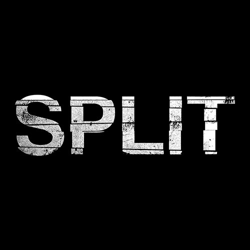
The ideas for this came from other thrillers such as split which also had a white writing and black background logo. The font also links to the title as the letters have cuts through them which split them apart.

Age Rating Reasons

We decided to choose a 15+ BBFC age rating for our thriller film, this is due to things such as the restricted use of violence and portrayal of drugs being extremely damaging and not showing them in a good light. I will go into more detail in the next few paragraphs. This is also suits our target audience which is around 15-35 age range.

The reasons as to why violence does not cause the film to be brought up to a 18 age rating is that any violence shown is not drawn out for very long at all and doesn't go near to being torturous such as films like the last house on the left. It is also not fully shown usually apart from several small parts and is usually insinuated.

The drug use in our thriller portrays as it being very damaging and does not encourage them whatsoever throughout the film, it shows its effects on mental health, social relationship and several other themes that may deter people from wanting to do it, this is why we believe it could fit into a 15 age rating, it also does not show the use of any hard drugs like needles for example which could push it into an 18

Friday, 17 November 2017

Props


We will also use a regular kitchen knife, this connotes the suicidal thoughts from the main character again and also shows the danger he is in.

Some more props we will be using are empty alcohol bottles and pill bottles/pills and other drug related things. This will show the characters bad background and that he is in a rough place. We will do the pills by using paracetamol or another legal pill. We could also do the LSD tab shown by printing something out on some paper. Another thing we will use during our trailer would be cigarettes, this shows that he doesn't really care too much about his own well being. This comes from a thriller film I have watched called 'traffic' where there is consistent teen drug use where things such as smoking, taking pills and other drug use are shown throughout.

One of the main props that will be used in our trailer is a gun, this will be made by painting an old bb gun black using spray paint. This shows the suicidal thoughts from the main character and also makes the audience wonder whether he will use it or not. One of the films we took inspiration for this was from the film elephant where high school kids use guns to perform a mass school shooting.

Production Company Logo


This is our production company logo and name. We called it Solitary Productions as solitary has connotations of being singular or on there own, this relates to our films as they are unique or different to others.

Solitary could also refer to solitary confinement in prisons which is what is shown as the logo, this links to crime which is one of the main aspects of thrillers.

Wednesday, 15 November 2017

Character Planning

Costumes -

Brad - Wears a black hoodie, black Jeans and black trainers throughout the trailer, one reason is due to the fact that black connotes mystery and even death and will make people intrigued about him. Also this is the usual clothing for a lot of people of the target audience wear this sort of clothing so they may be able to relate with the main character

Brads friends - They will also be wearing similar clothing to brad, dark clothing, this makes the film even more relatable and realistic as most of the target audience will probably know people who are like this or even be a part of a group like this.

Brads Parents - They will both be wearing very stereotypical clothing for middle aged parents, this again could help people relate to the main character.


Makeup - the only time we will probably use makeup is the  fake blood on brad and maybe some of the other characters

Friday, 10 November 2017

Thriller Trailer Pitch

Link -

https://youtu.be/7KKNDMQF_ds

Feedback -

One of the comments we received was a question asking how we would get a gun, the way we are doing this is using an old realistic BB gun and spray painting it black rather than the original blue colour to make it look like the real thing. We would also keep this inside at all times due to the problems that may arise from taking a gun that looks real into school or down a street.

Another comment we received was the fact that there are no female characters named in the pitch. The female characters included is the abusive mum who falls under the abusive parents part of the pitch and the main charter Brads friends could also include some females.

We also received a comment about whether or not we were sure about the film being a 15, We do believe that it should be a 15 due to the fact that the violence is fairly quick and not prologue or detailed enough like torture. Drugs are also shown to be very damaging and are not encouraged or promoted by the film which means it again falls into the 15 category.

Thursday, 28 September 2017

One Missed Call Film Poster Analysis


The main colour scheme is black, white and red. This allows for the white and red writing to stand out on the black background more and gets the audience to focus on this writing such as the red writing at the top stating 'What will it sound like when you die?' This makes the audience uneasy and wonder what it means and may intrigue them to watch the film to find out, the red also connotes the danger in the film. It also makes the main image in the center stand out more to the audience.

This main image in the center of the poster also makes the audience uneasy as it is on a black back with no bright colours around it, this creates an eerie feel for the figure in the middle and makes the audience wonder who it is and what it is doing on the phone. It is a closeup of the face of the character and shows that it is going to be an important character in the film. The dark background around it could connote mystery or death which heavely links to the genre of the film and lets the audience know what they are in for while watching it.

Saturday, 9 September 2017

Shutter Island Film Poster Research


The first film poster I looked at was the poster for Martin Scorsese's thriller film 'Shutter Island'. This was because it is the same genre as the trailer that we are producing. Some of the main aspects of this poster include the colour of it, all of the colours used are very dark, dull and neutral, this makes the film seem more mysterious and the dark colours like black could connote death. The only other colours are red for the title 'Shutter Island' which connotes  the danger of the island. The flame is also the only other coloured part which again shows the danger of the situation and makes the audience wonder why there is a flame.

The two images used in the poster is a closeup of the main character of the film holding a match which is illuminating his face, this shows he is in the dark and makes the audience wonder as to why he is. The expression of his face is a mixed of scared and confused and further shows the genre as a thriller as it must have some sort of mystery in place. The other image is an establishing shot of the island the film is based on, it is basically a silhouette and creates a sense of obscurity so the audience doesn't really know what to expect and would be intrigued to watch and find out

The fonts used throughout this film poster are all very bold and sans serif, this shows that it is a much more serious film, the wording of parts also helps market the film. the small white tagline saying 'Someone is missing' is very good at creating a sense of mystery as it makes the audience wonder many questions like who it is, where they've gone, why they've gone etc, this will make them more likely to watch the film to figure out what has happened

Wednesday, 5 July 2017

Copy Of A Real Film Magazine

The Original Magazine

My Attempted Copy Of The Magazine

I got the background picture of the alien by using a picture from the movie and roughly placing it in the same place as the original magazine cover, the lines across the 'Empire' and 'Covenant' were done by simply drawing lines using the straight line tool and turning them to the same shade of green as the writing to give it the effect. I made it look like the alien was ahead of the Empire by using the eraser on the parts of the Empire logo that covered the head, this gave the alien the effect that it was more 3d and coming out of the page a bit.

Monday, 26 June 2017

Total Film Shutter Island Issue Annotated


Film Poster Copy

We copied a made up film poster to practise some photoshop techniques such as how to make a gradient and cut something out. This could help with the future film poster as these techniques are very useful to make a professional looking poster