This was the first draft for the logo of our film, this was mainly done just to get the idea for it and practice the techniques of making the split knife look with the text inside. For our actual logo we will improve by making the whole blade visible by using a larger space to make it on and we may improve by finding a better font more suited to the thriller genre and maybe a better looking knife however the simplicity of the knife in this logo helps it stands out so we may keep it. The final thing we will do is make it look more clean so the knife is flush with the text, this will give it a much more professional look

This is the finished and improved logo that we came up with , the first improvement is that the whole blade is actually shown which makes it look much more completed. The quality is also fairly improved and is not as blurry as the first draft. The font used in the final logo is also much more suited to the genre and professional looking. The knife is also perfectly flush with the text so it looks seamless and much better than the original draft.
The reason for using the knife in our logo is that it links heavily to the story line due to the suicidal themes throughout as well as the title itself being edge which could connote the edge of a knife. The slashes in the word edge again link back to the suicidal thoughts and self harm as it suggests the cutting that having a mental illness leads some people to do. Even the black background connotes death and again links back to these suicidal thoughts that the main character is having.
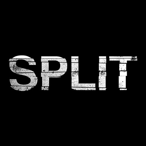
The ideas for this came from other thrillers such as split which also had a white writing and black background logo. The font also links to the title as the letters have cuts through them which split them apart.


Clearly presented post. Effective logo, well done. Sir
ReplyDelete